Part of the in-house Design Team with KIND Snacks, owning and evolving the brand along with major growth.
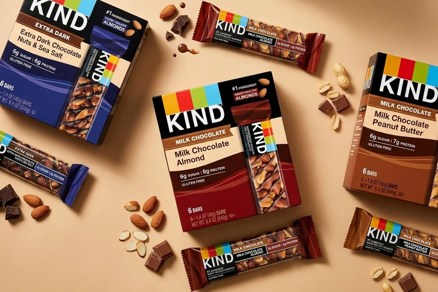
Elevating a Best Seller Through Packaging
This line extension elevated KIND’s best-selling bars with a richer, more indulgent chocolate presence while staying true to the brand’s core architecture. We developed a fluid pattern system and deeper color palette to signal added decadence without losing recognizability.
I led the concept and directed the design team, remaining hands-on through refinement, prepress, and production, partnering closely with printers to ensure the final result delivered the depth and quality the design called for.
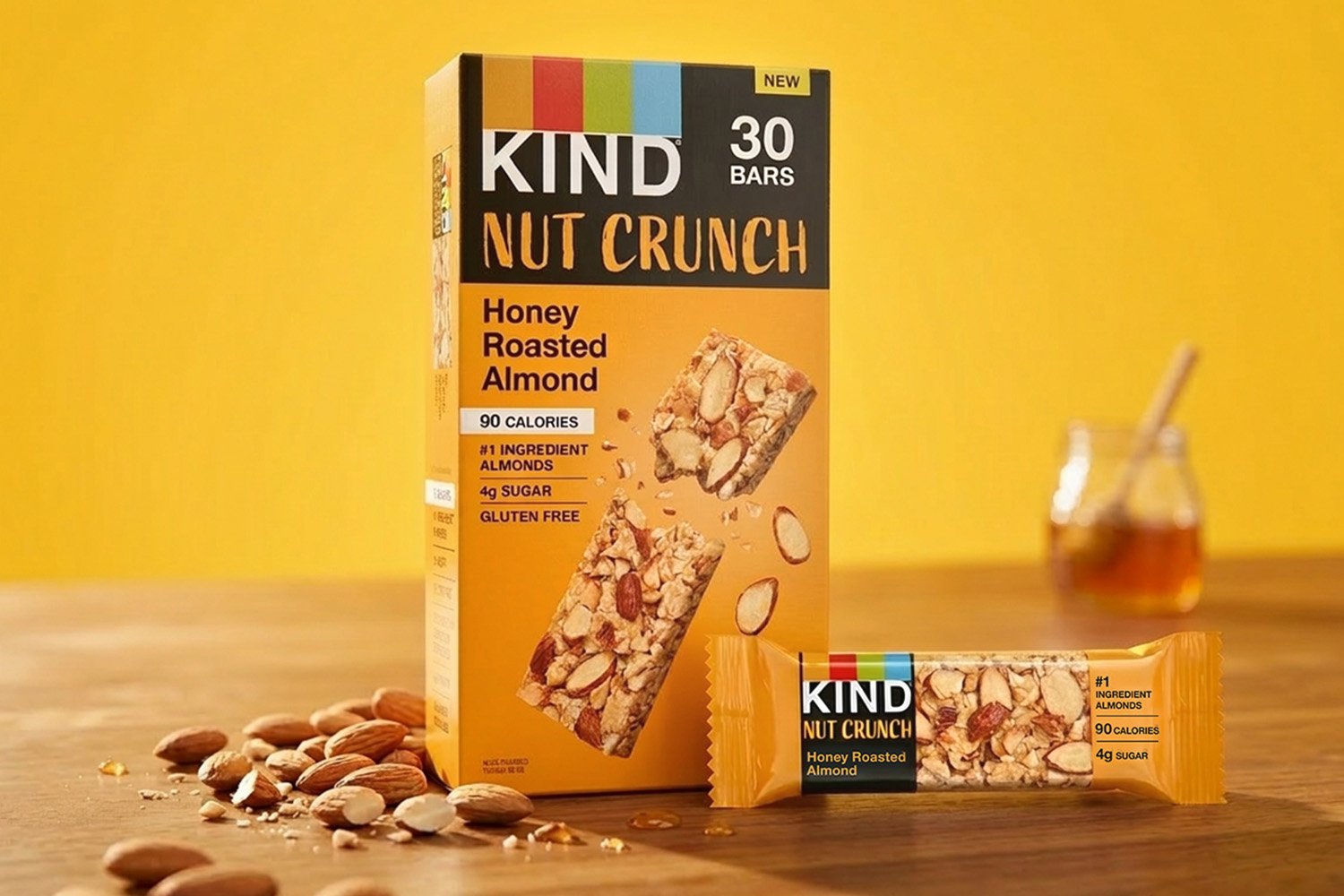
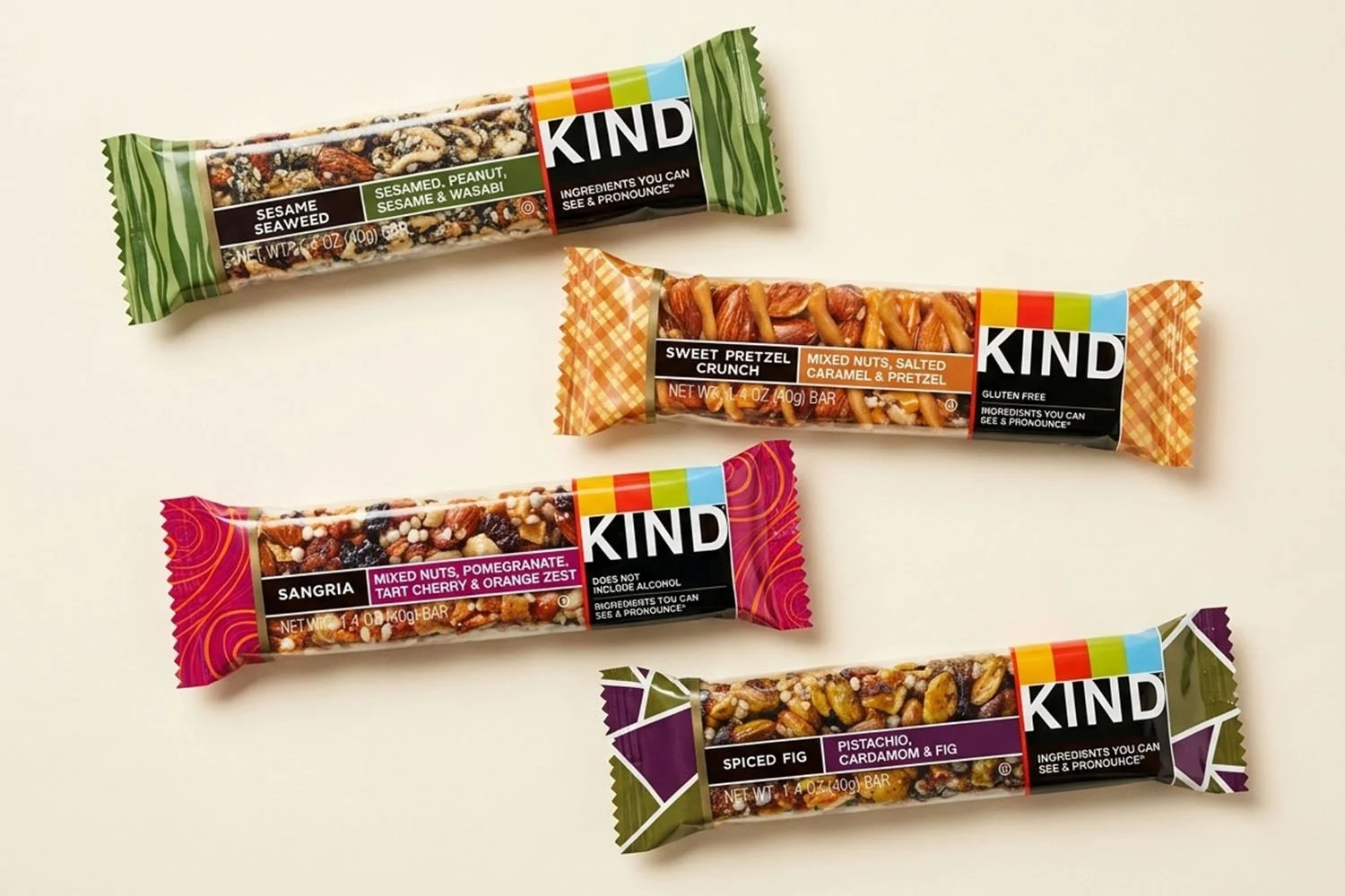
New Product Launch Packaging
Led Art Direction for new product launch packaging focused on texture and ingredient intensity. Partnered with Brand Marketing and Sales to shape the visual story, directing photography and typography to bring “crunch” to life at shelf. Oversaw execution from concept through production.
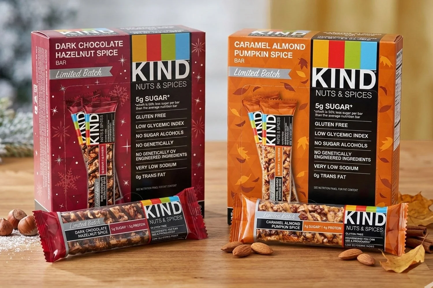
Limited Batch Packaging
As lead designer for this seasonal extension, I developed custom graphic systems for both flavors. One leans into winter with snowflake and shimmer patterns, while the other captures autumn through layered leaf graphics and a warm, harvest-inspired palette.
I also created the wrapper patterns and the “Limited Batch” banner, using a subtle retro type treatment to introduce personality while staying true to KIND’s established architecture.
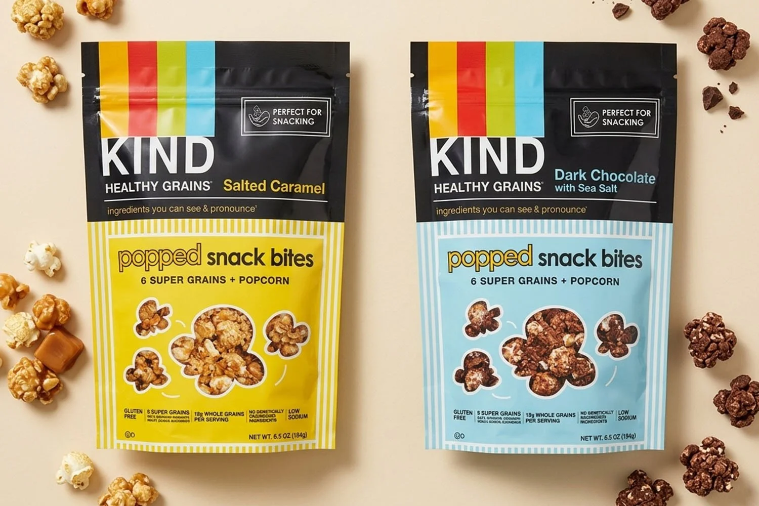
Packaging Design
As senior designer and creative lead on this launch, I explored multiple directions to express the light, airy nature of the product while staying true to the existing Healthy Grains “Popped” architecture.
After initial concept reviews, I partnered closely with brand to refine and elevate one of the stronger early directions, evolving it into a solution that better balanced differentiation and brand consistency. The final design delivers clear flavor distinction, vibrant shelf presence, and a playful energy that reflects the product’s texture and personality.
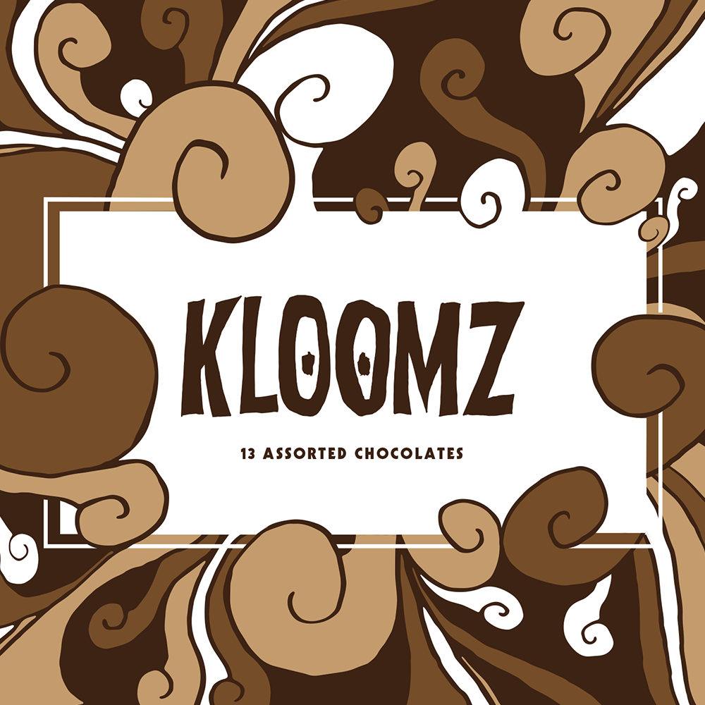
Special Packaging
For this special “Name Your Flavor” promotion, I developed bold pattern and color systems for each proposed flavor, designed to capture the personality of the flavor itself rather than follow standard brand conventions.
The goal was to create something distinct and unexpected, with wrappers that felt expressive and vibrant, signaling a unique limited edition moment within the KIND portfolio.
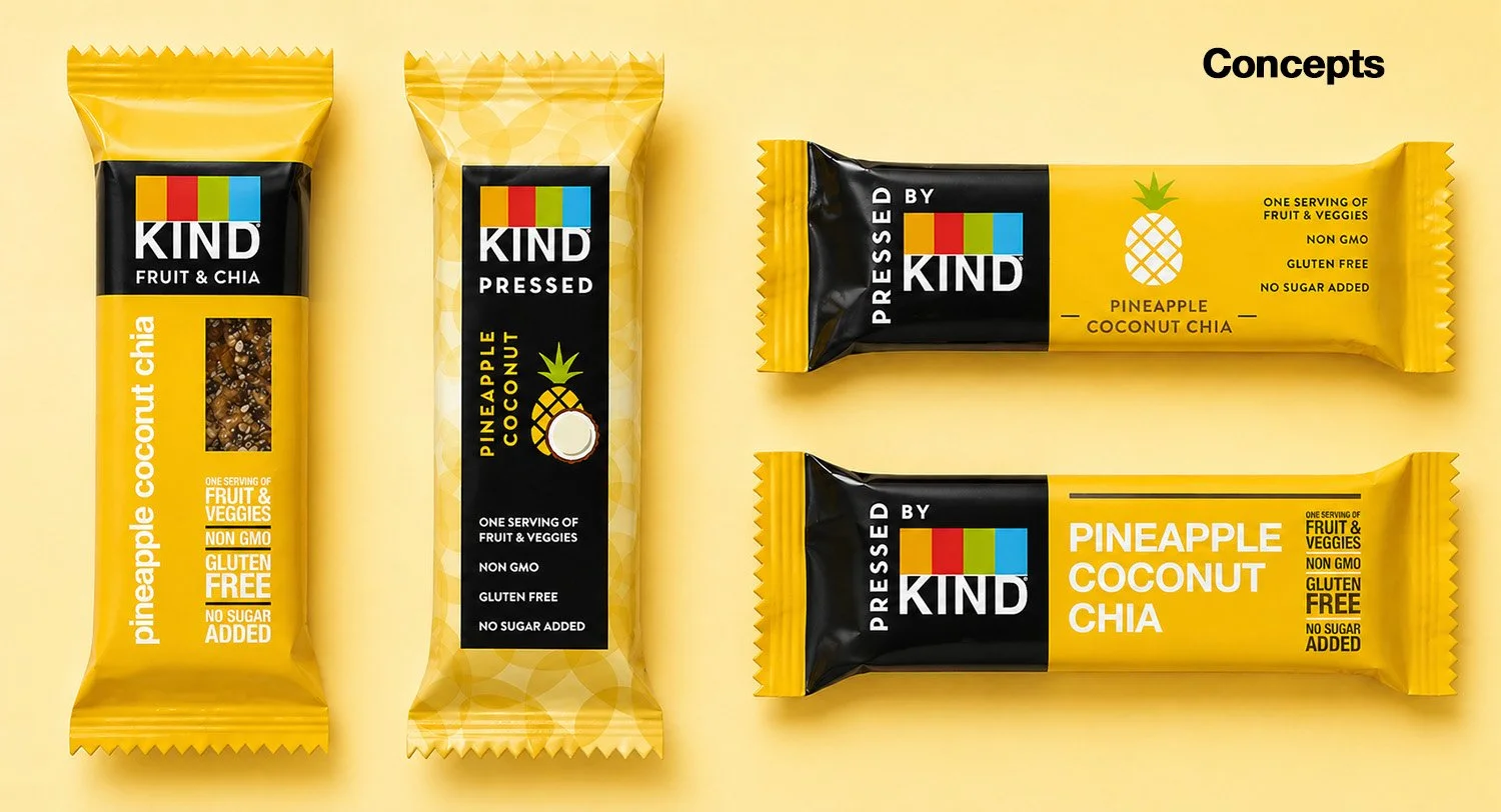
Concept packaging exploration for KIND’s “Pressed by KIND” line, inspired by the look and feel of fresh juice bars and cold-pressed drinks. The designs focus on bold color, clean type, and simple ingredient cues to communicate freshness and transparency. The goal was to create something that feels modern and distinct on shelf, while still clearly part of the KIND family.
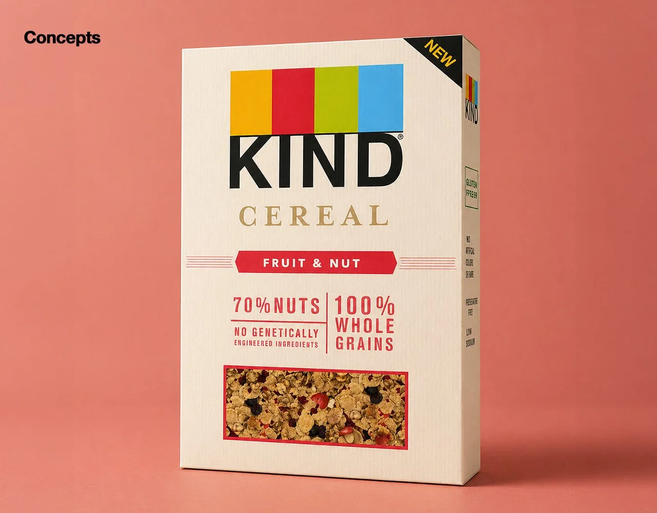
Concept direction focused on a more natural, ingredient-forward feel. The design uses warm tones, subtle texture, and a clear product window to highlight what’s inside, paired with bold, simple typography for strong shelf impact.
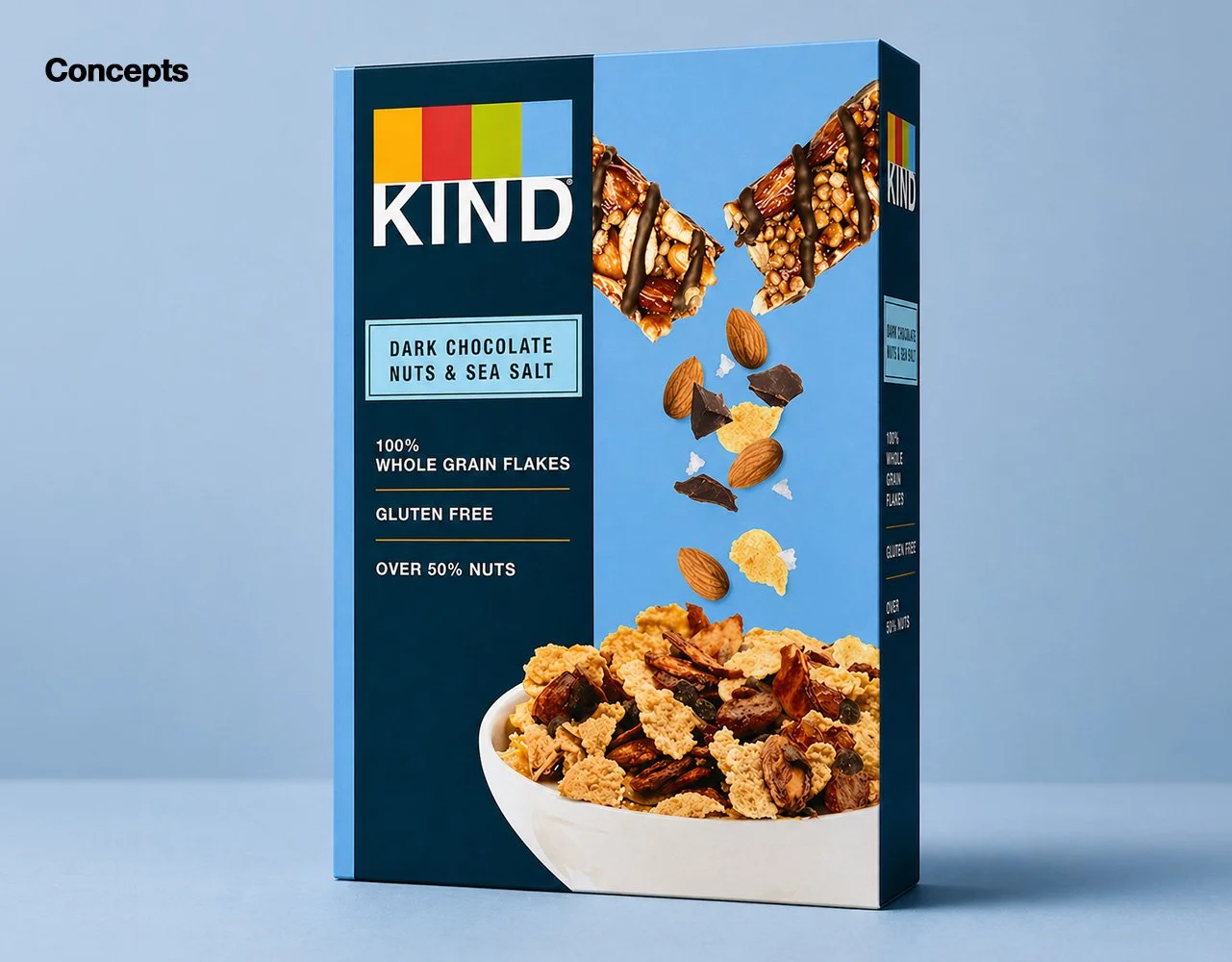
Concept direction that leans into a more recognizable KIND look and feel. The design brings the product story to life with a KIND bar breaking apart into the bowl, using bold imagery and clean structure to connect the bar to the cereal in a clear, engaging way.
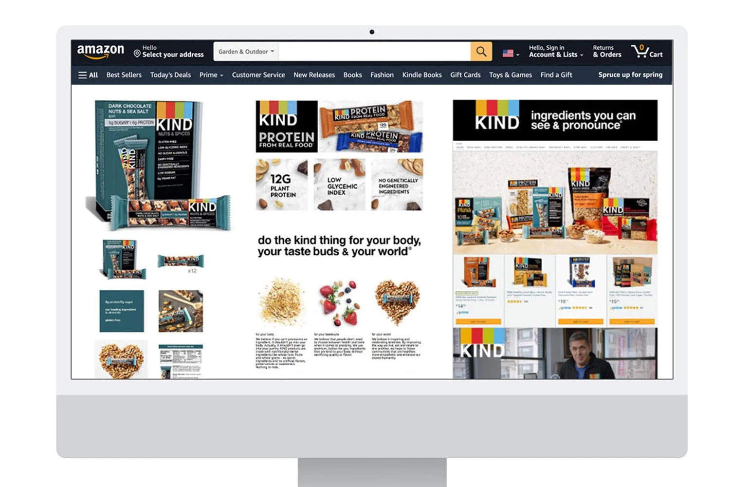
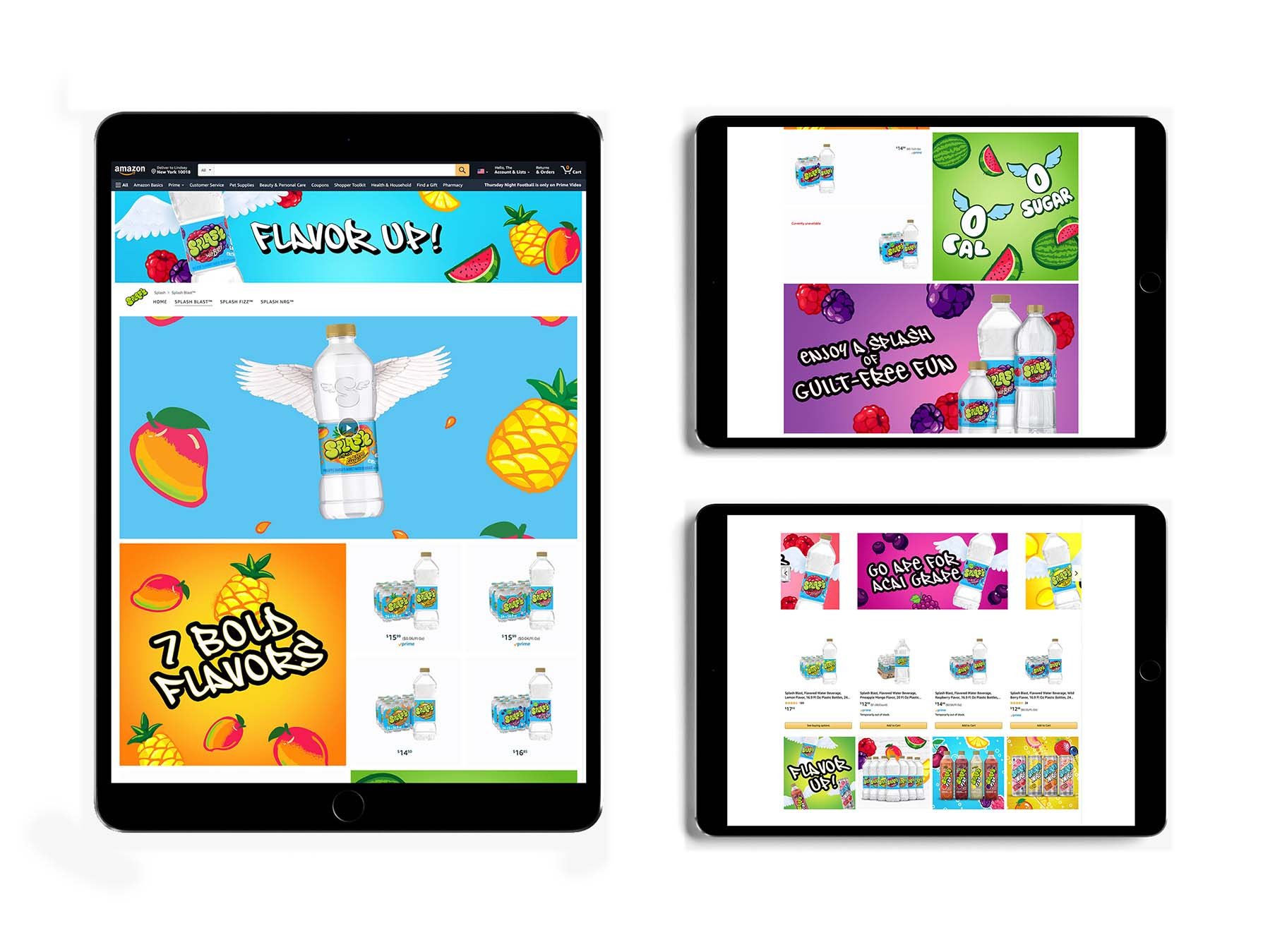
Led the design of KIND Snacks’ Amazon.com presence, creating a cohesive visual system across product imagery, A+ content, and the brand store. Partnered with Brand Marketing and eCommerce to define direction, then art directed execution across multiple product lines. This work brought consistency and clarity to the brand experience across Amazon.
Role: Designer
Scope: T-Shirt / Tradeshow Booth
Role: Designer
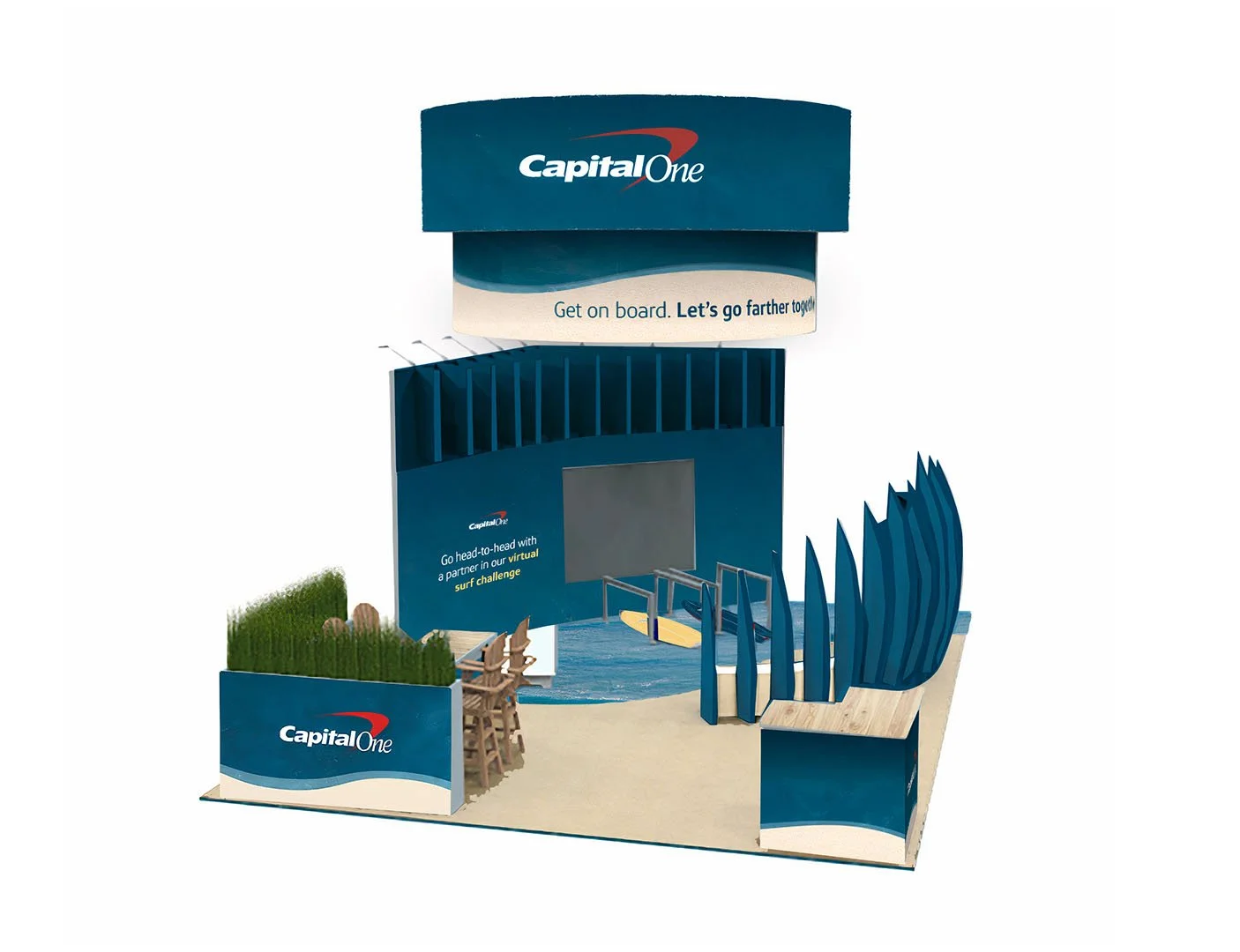
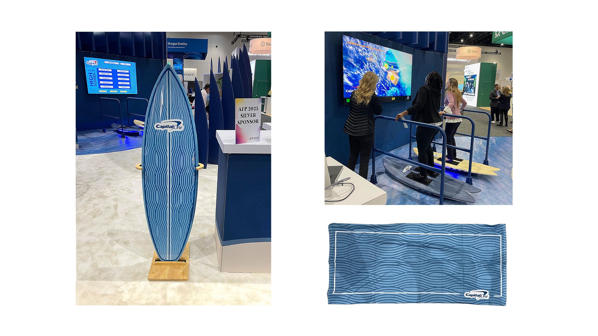
Scope: Tradeshow Booth
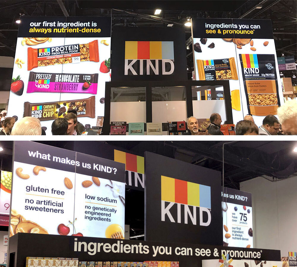
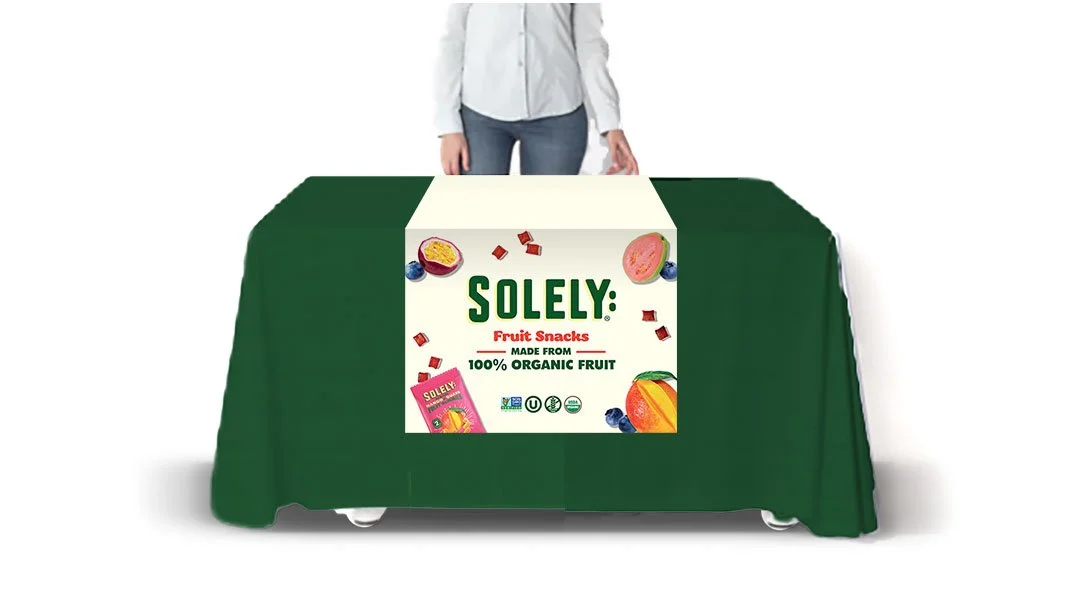
Role: Designer
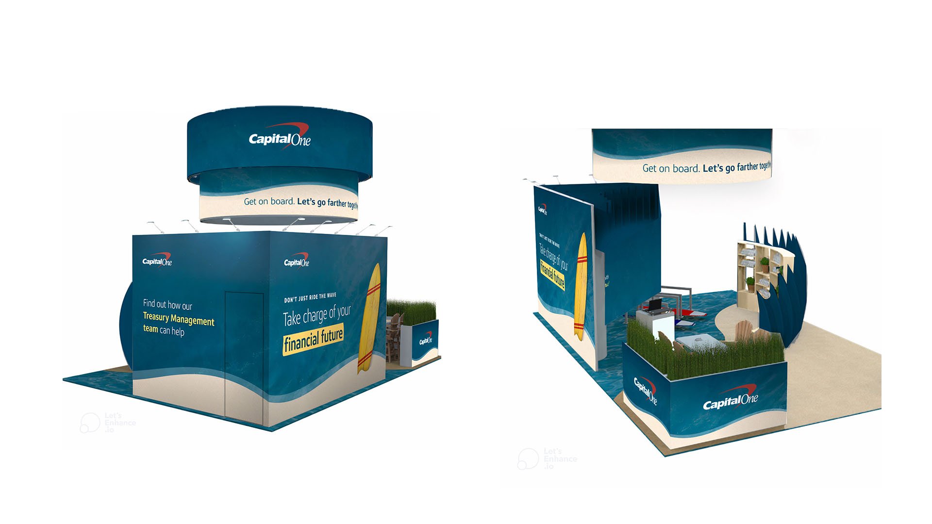
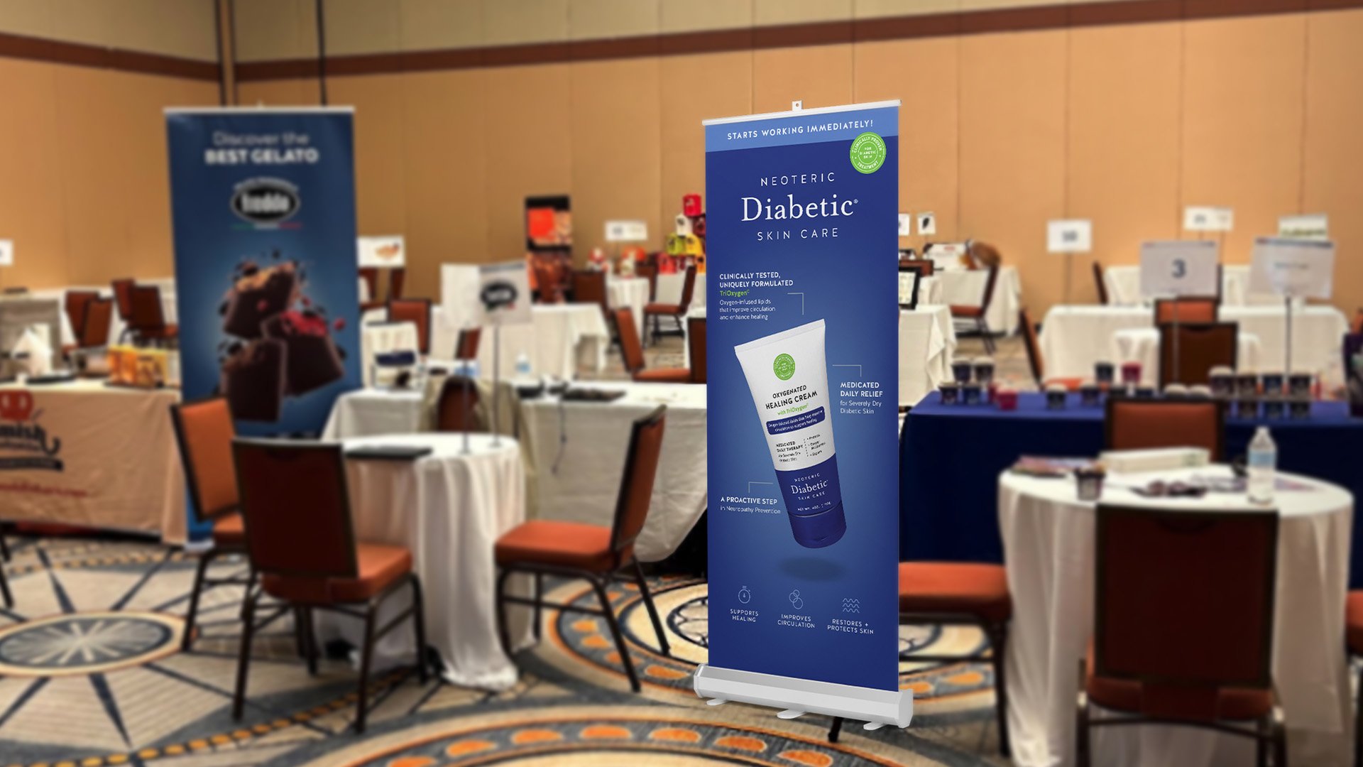
Scope: Tradeshow Booth
Role: Designer
Scope: Tradeshow Boot
Role: Designer
Scope: Tradeshow Boot
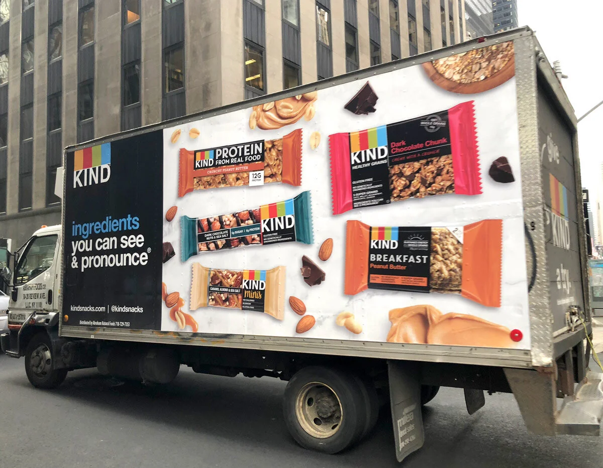
Role: Designer
Scope: Truck Wrap
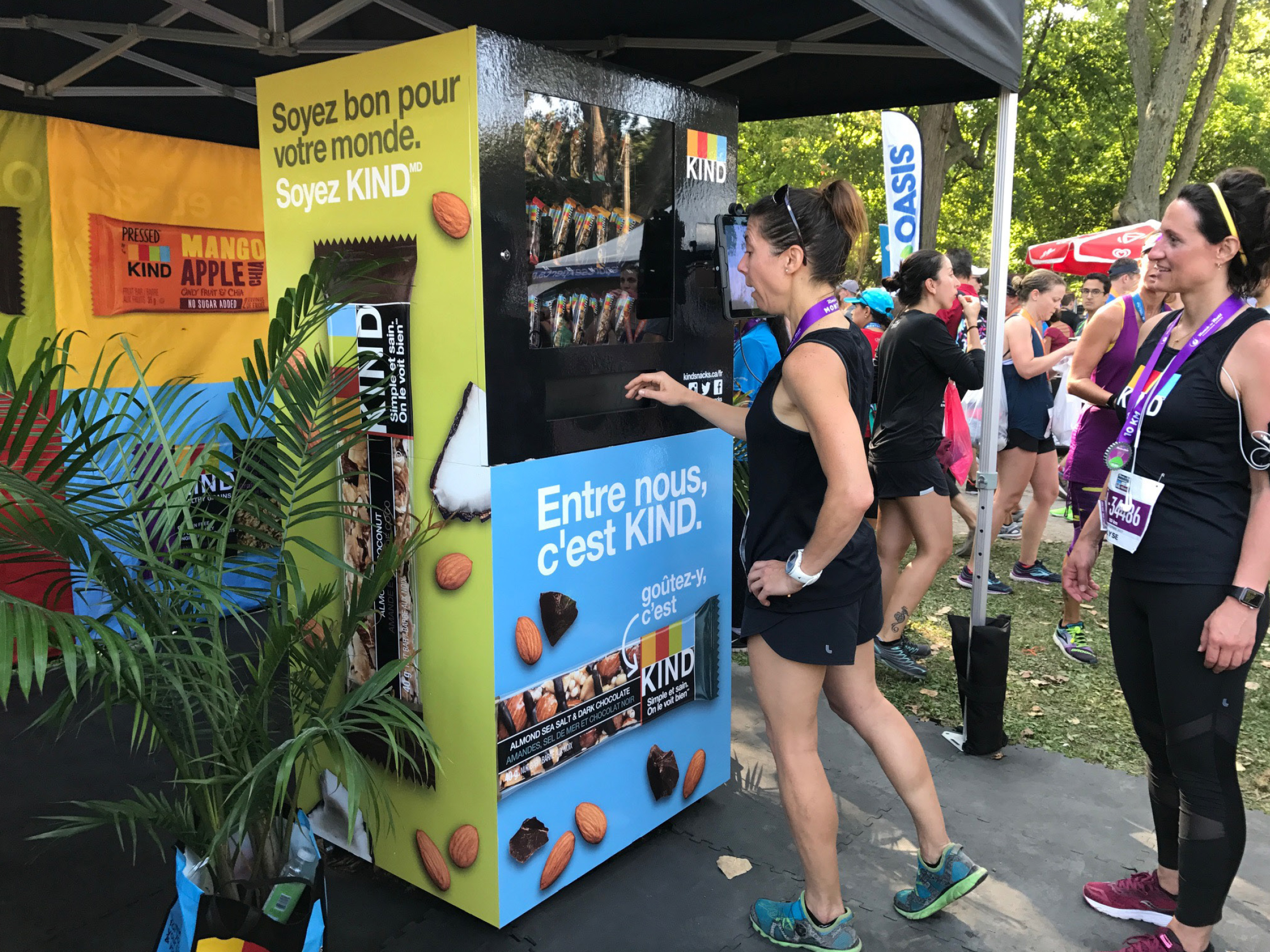
Role: Designer
Scope: Vending Machine Wrap
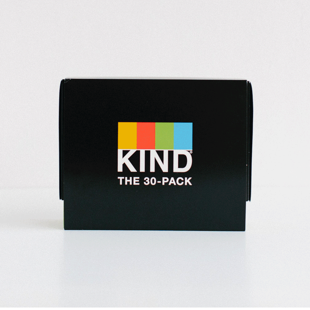
Role: Art Director / Manager
Scope: Club Store Packaging
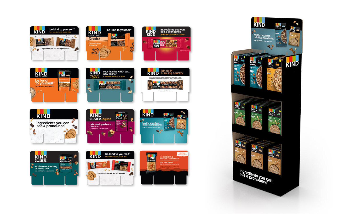
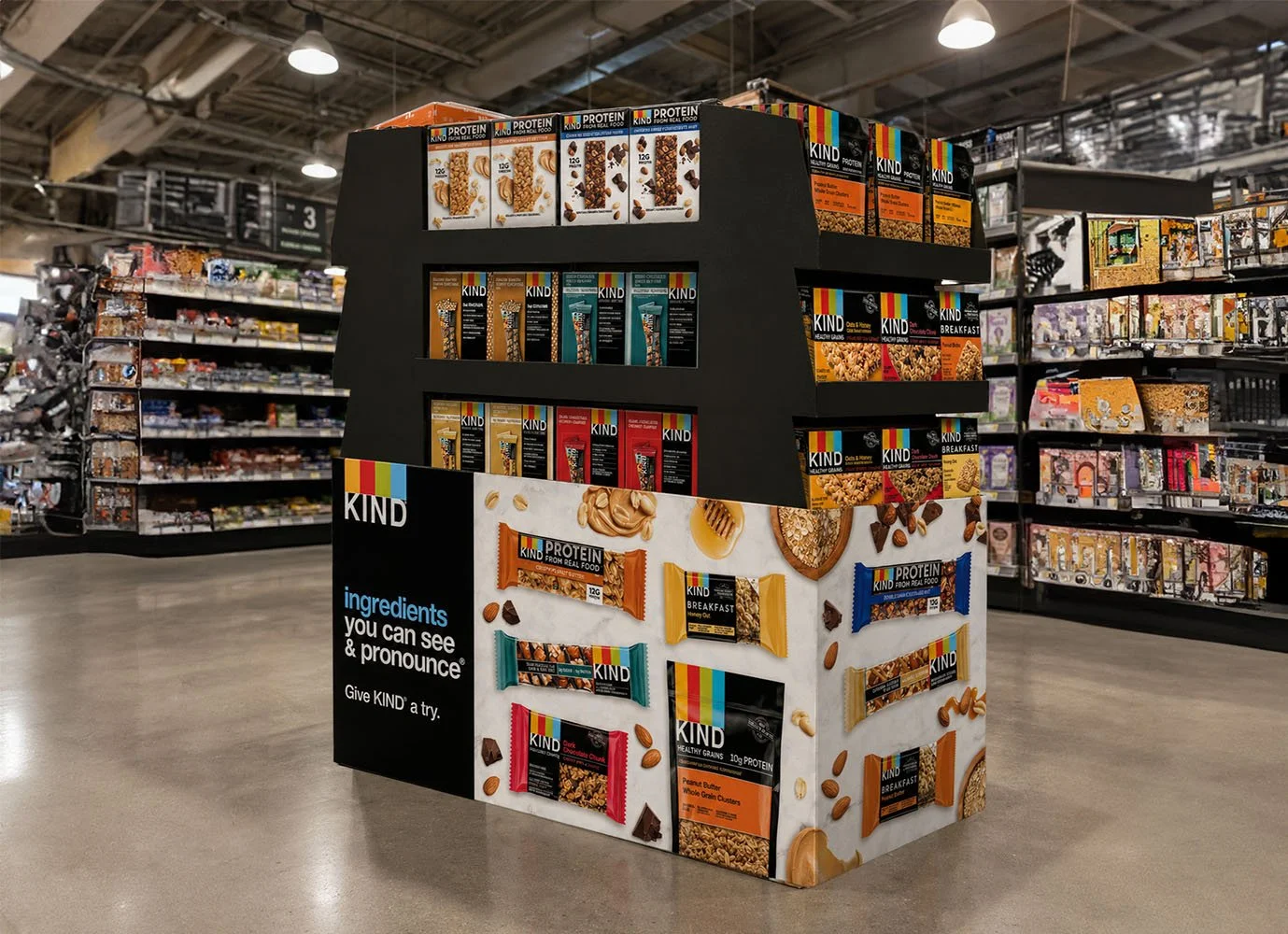
Role: Art Director / Manager
Scope: Point of Sale Displays
Role: Designer
Scope: Mailer
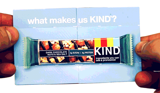
Role: Designer
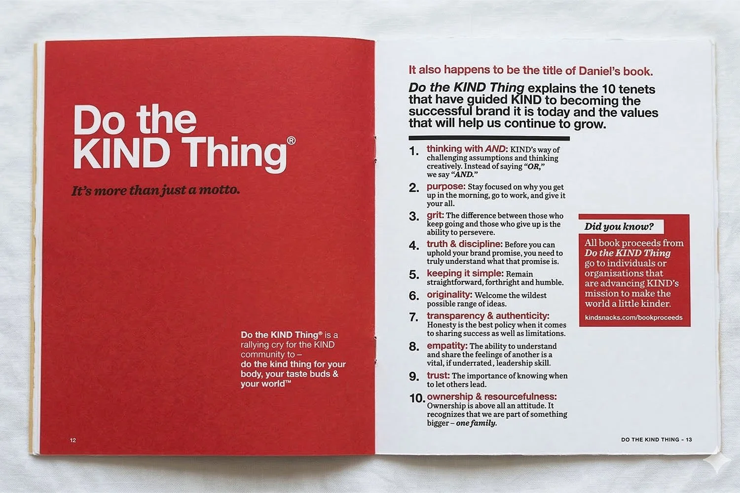
Scope: Booklet
Role: Designer
Scope: Special Packaging
Role: Designer
Scope: Graphics
Role: Art Director
Scope: Look & Feel of Collateral
Role: Art Director
Scope: In-Store Retail Signage
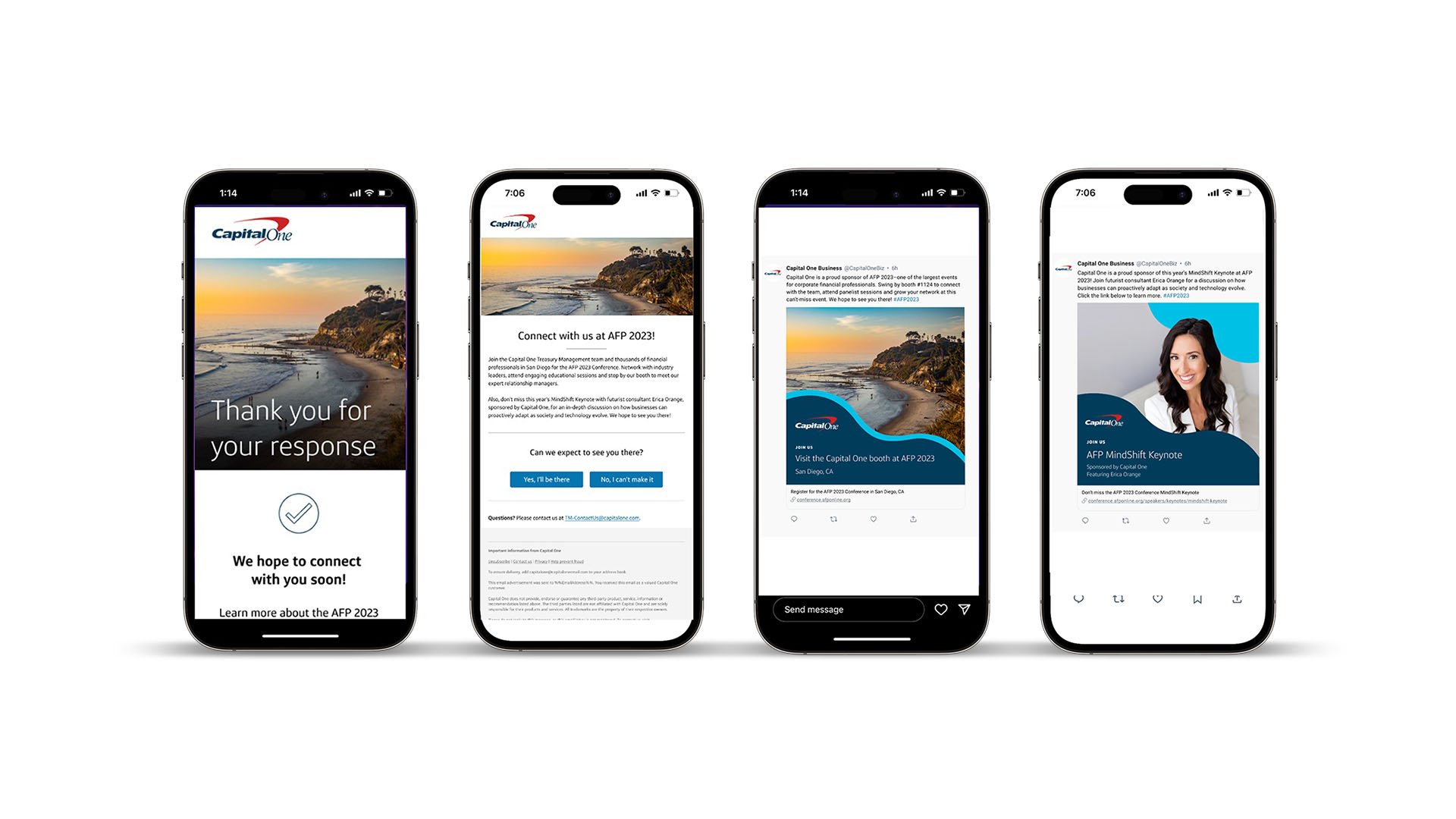
Working with Capital One in the role of Art Director on the Experiential Commercial Events team.
I was brought in to a different team at Capital One to partake in a design sprint with other designers to explore packaging which would live in airports. I was able to explore designs ranging from "close-in" on brand, to ones more pushing the norm.
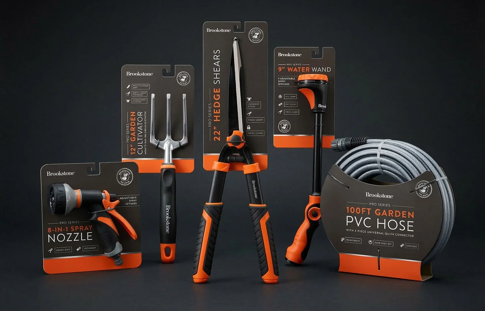
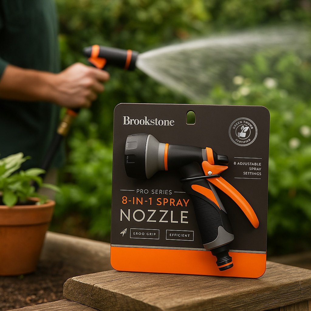
Brookstone Pro Series is a premium line for gardening tools. I created the look of the packaging and worked with various designers to ensure the look & feel was maintained across products.
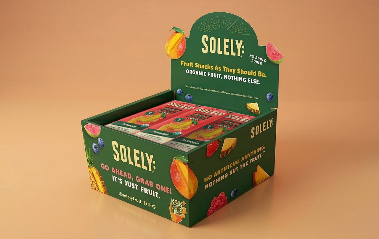
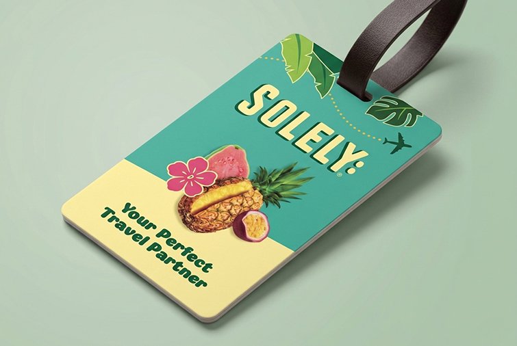
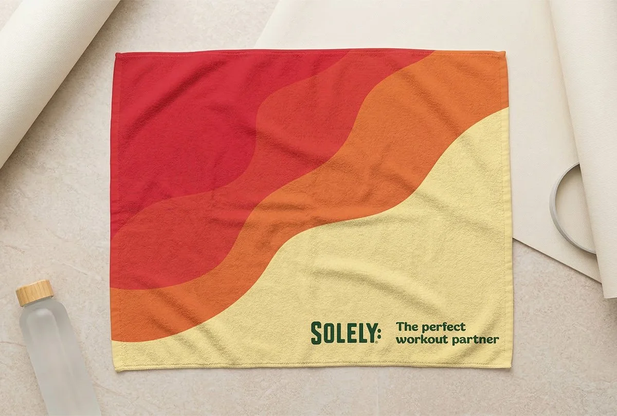
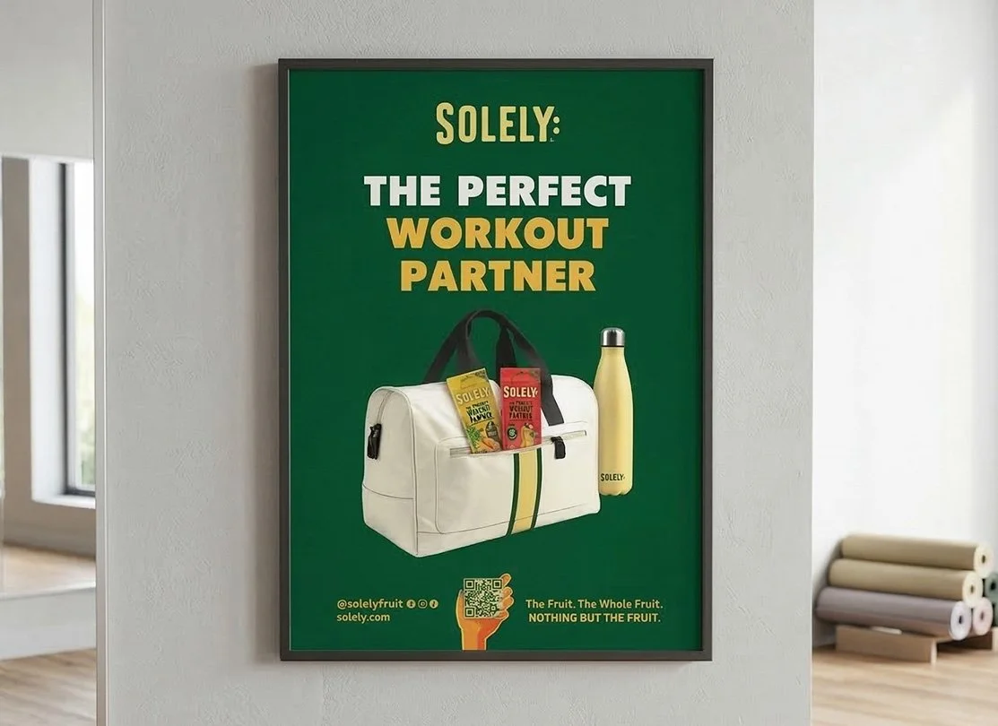
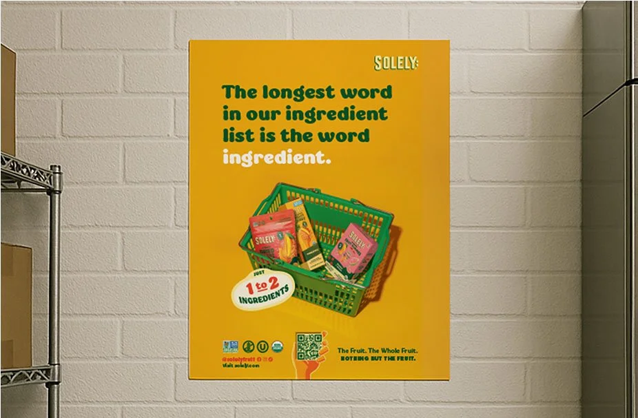
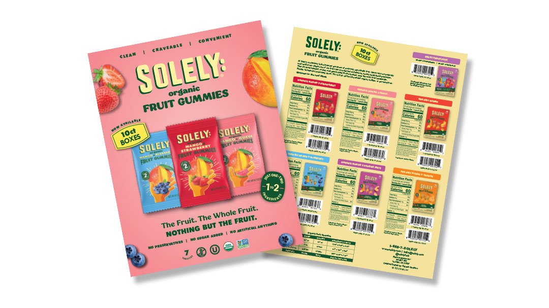
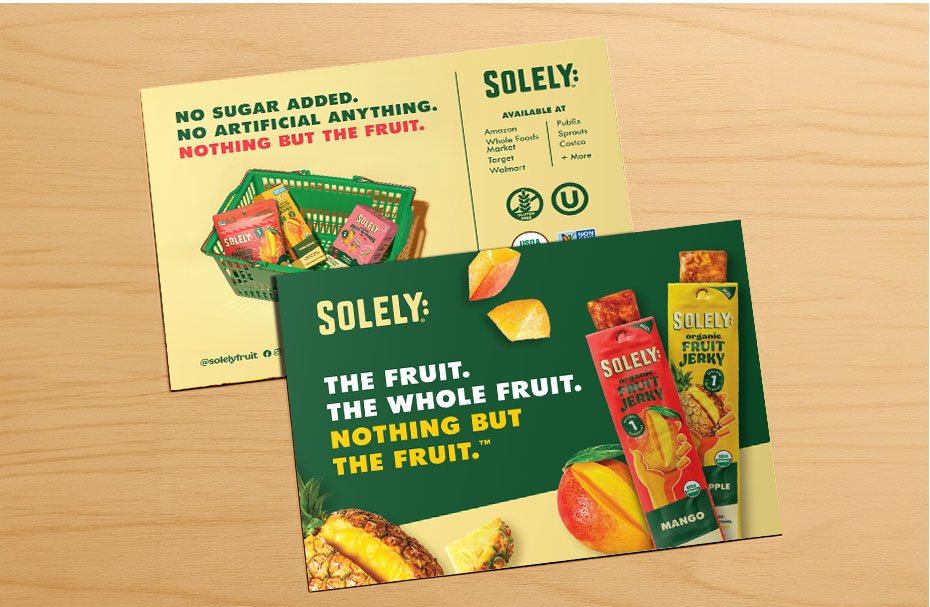
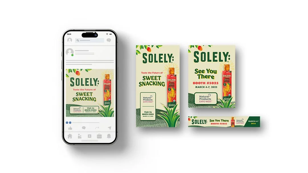
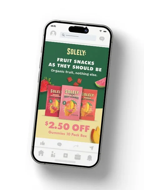
Brought the Solely brand to life following a brand & packaging refresh.
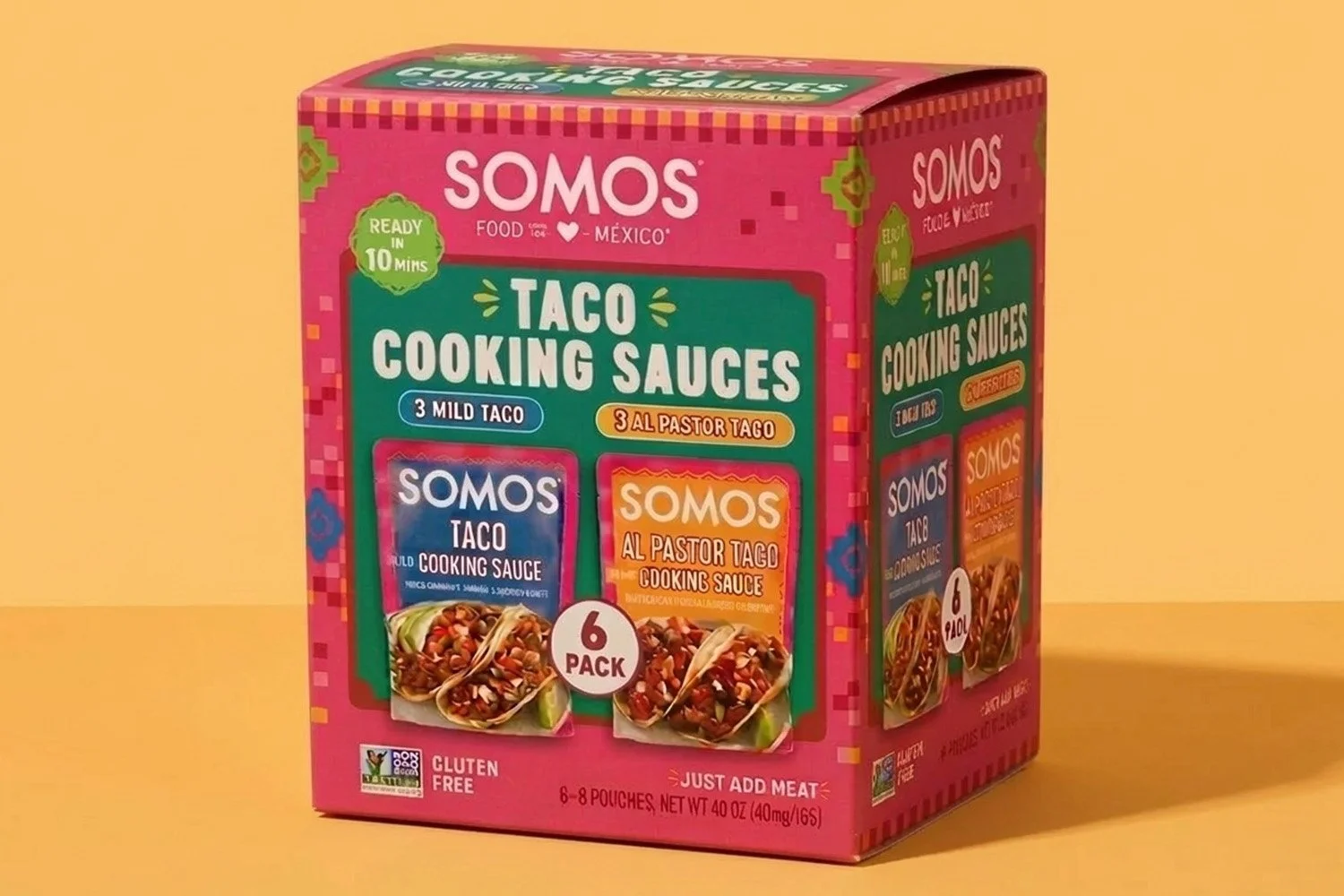
Lead Packaging Designer
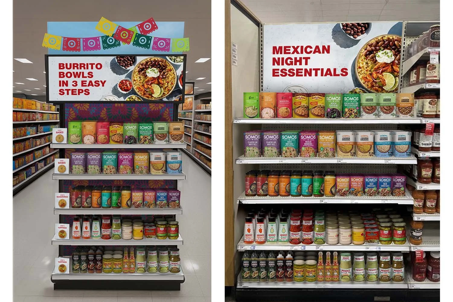
Led packaging design for this SOMOS Taco Cooking Sauces club pack, partnering closely with the Creative Director to translate brand vision into a bold, high-impact retail execution. Developed a continuous billboarding system across panels to maximize visibility and cohesion in club environments, ensuring the design held strong both as a single unit and in palletized display. Balanced vibrant shelf presence with clarity, compliance, and production readiness from concept through final print.
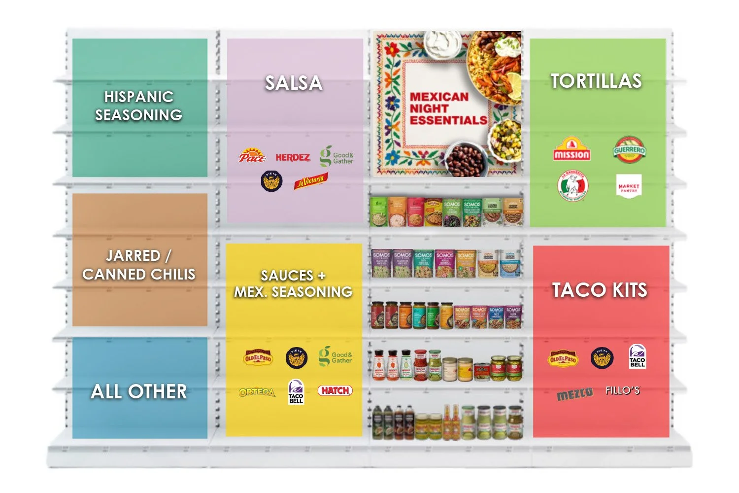
We developed a concept for a “Mexican Night Essentials” retail destination, bringing together everything needed for a complete meal in one easy-to-shop space. Rather than focusing only on SOMOS, the idea shows how the brand could partner with retailers to create a broader category experience through cross-merchandising and smart in-store design.
Working with The Mars Agency in the role of
Art Director
Role: Art Director
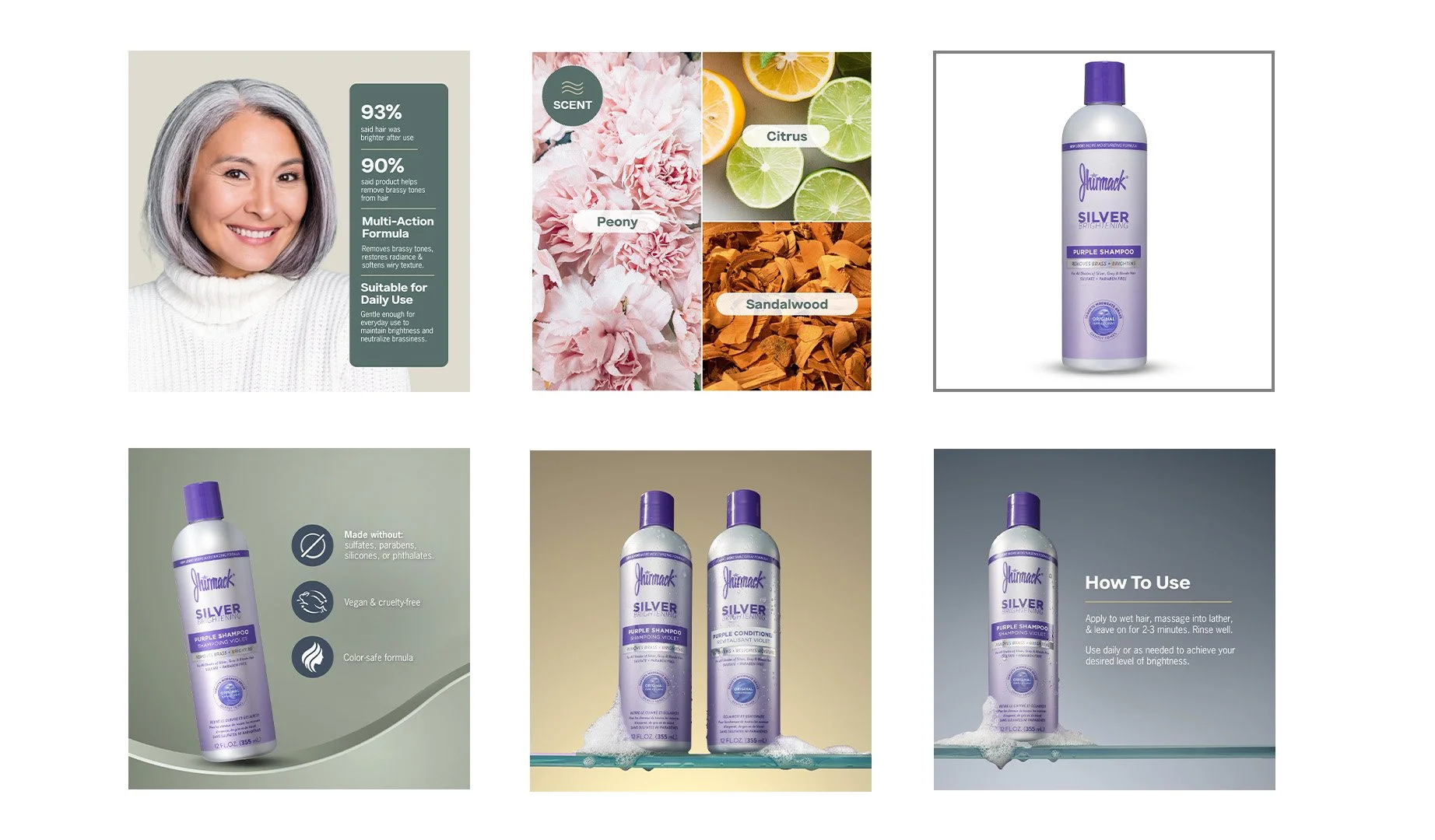
Scope: eComm Design
Role: Art Director
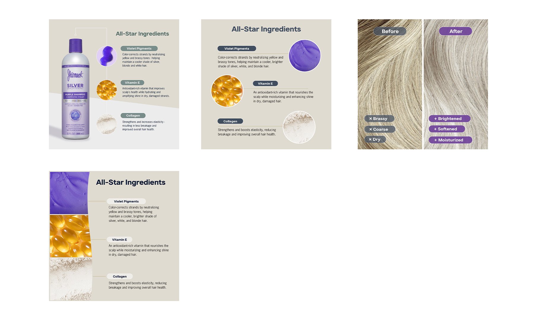
Scope: eComm Design
Role: Art Director
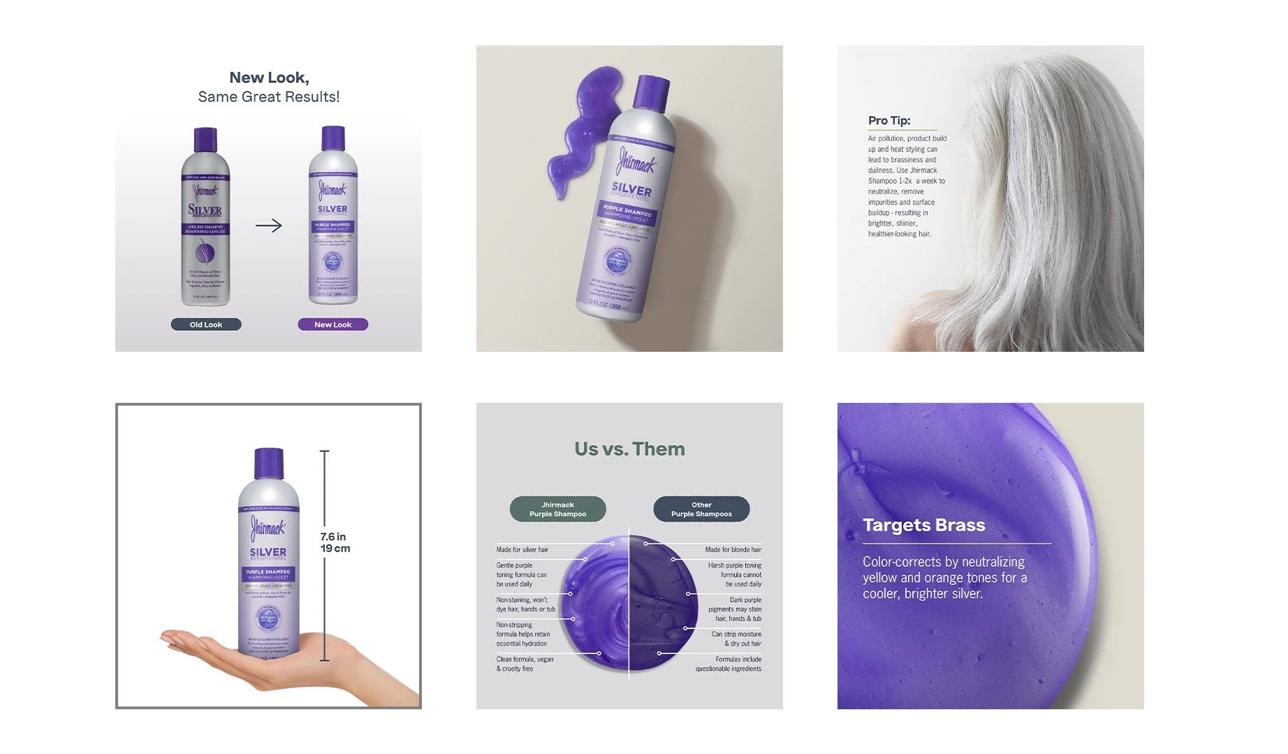
Scope: eComm Design
Working with The Mars Agency in the role of Art Director
Role: Art Director
Scope: eComm Design
Role: Art Director
Scope: eComm Design
Developed the look & feel of collateral to accompany a new look following brand refresh.
Role: Designer
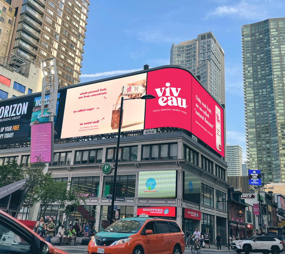
Scope: Billboard Design
Role: Contributing Designer / Art Director
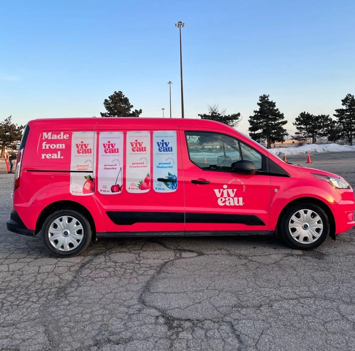
Scope: Van wrap design
Role: Designer
Scope: Mailer Box + Inserts
Role: Designer
Scope: Social Post (Instagram) Design
Role: Designer
Scope: Truck Wrap Design
Role: Designer
Scope: Mailer Box + Inserts
I created the logo for a new speak-easy style bar, The Terrace.
From the street, the windows are filled with clothing like your classic tailor shop. The logo goes with this showing the classic clothing pin.
Upon entering, you find a modern, classy cocktail lounge. You look at the logo again to see that it also looks just like your martini glass when you look down at your cocktail.
I created the logo for a new neighborhood beverage store, Uncorked. With bold typography, vibrant color work , and a unique treatment of the letter "k", Uncorked becomes more than just a store sign, but a memorable, attention grabbing marker to support this new store.
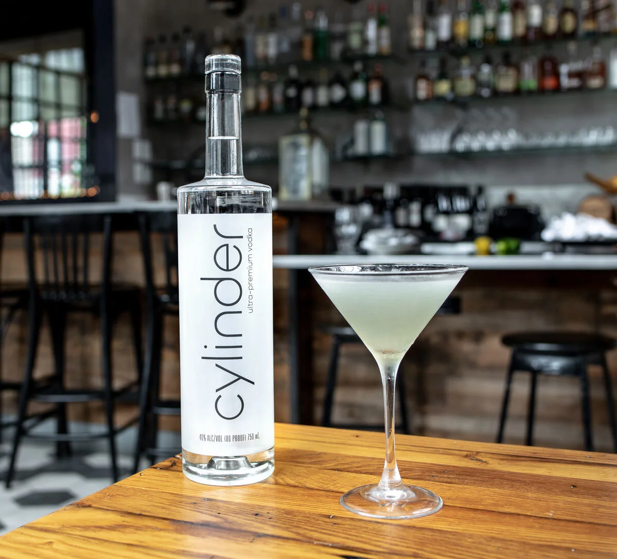
I was a contributing designer to the development of the Cylinder logo. I was given the previous logo which was rigid, and made it a more slick logo with emphasis on curves. Paired with a frost coating on the bottle for a minimalist treatment, the outcome is a slick, premium vodka bottle.
Role: Designer
Scope: Cover Art
Role: Designer
Scope: Cover Art
Role: Designer
Scope: Feature Art
STUDENT WORK
Role: Designer
Scope: Poster Design
STUDENT WORK
Role: Designer
Scope: Branding
STUDENT WORK
Role: Designer
Scope: Branding